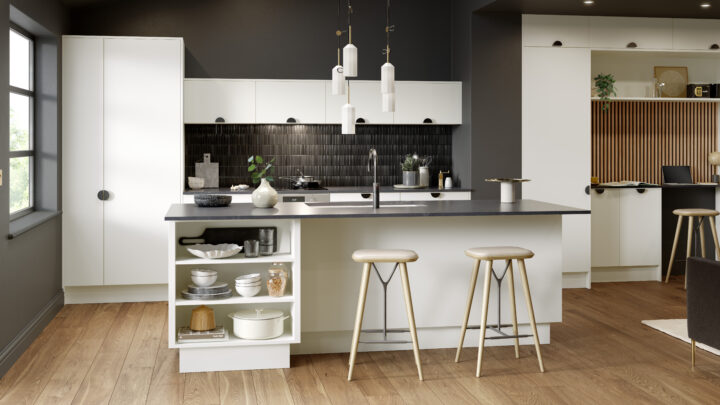
Why Living‑Room Colour Trends Belong in Your Kitchen and Bedroom
The most popular living‑room shades this season are versatile, layered and designed to make a space feel both composed and lived‑in. Borrowing them for kitchens and bedrooms is a smart way to achieve a fresh, considered scheme without the cost or disruption of a full remodel. Replace only what you need—doors, end panels and handles—and let paint do the heavy lifting on mood and cohesion. With replacement frontals from Doorfinder (high‑gloss doors from £10.06, handleless from £13.01, matt from £11.65, and shaker from £21.94; wardrobe doors from £14.27), you can coordinate cabinetry to suit any of these palettes while keeping total spend in check.
Translating Trend Colours into Practical Door Pairings
Below is a colour‑by‑colour guide to help you pair current living‑room shades with kitchen and wardrobe doors, panels and accessories for results that feel curated rather than “colour‑matched”.
- Dark olive or moss green for a cocooning, heritage feel
- Why it works: Rooted, library‑like depth that flatters period details and warms modern shells.
- Pair with: Matt shaker doors to echo traditional joinery; warm wood end panels and open shelves; brass or aged‑brass handles to introduce gentle shine. If you prefer a crisper edge, specify slim shaker rails and a finer bead.
- Accents: Natural stone or stone‑look worktops; linen roman blinds; antique rug runners in terracotta or rust.
- Grey‑brown (greige’s moodier cousin) for a clubby, cosy vibe
- Why it works: Adds richness without reading as “dark grey”; fantastic at hiding scuffs in high‑traffic areas.
- Pair with: Oak‑toned panels and plinths; flat bar handles or knobs in matte black for definition; textured fabrics (bouclé stools, wool runners) to lift the scheme.
- Doors: Matt slab or slim shaker doors keep the look tailored. Consider wardrobe doors in the same tone for continuity across open‑plan spaces.
- Deep inky blue or teal for drama
- Why it works: Saturated contrast that sharpens lines and makes metallics sing.
- Pair with: High‑gloss white or pale‑grey handleless doors to bounce light and prevent heaviness; ribbed/reeded glass wall units or splashback panels to add texture; polished chrome or brushed stainless for a cooler, contemporary note.
- Tip: Use the dark tone on a single wall or island to anchor the room; keep tall runs light.
- Sage or steely green as adaptable near‑neutrals
- Why it works: Calm, complex undertones that shift with daylight; easy to live with.
- Pair with: Matt neutral doors (e.g., warm white, light taupe) and light woods such as ash; nickel or pewter hardware for a soft, silvery link.
- Good for: Bedrooms and utility spaces where you want freshness without full‑on colour.
- Cloudy or slate blue for calm in galley kitchens
- Why it works: Recedes visually to widen narrow rooms; soothing yet architectural.
- Pair with: Light, reflective doors—high‑gloss pale grey or gloss white handleless—to maximise bounce; use the blue on walls or even the ceiling to “raise” it.
- Detailing: Slimline LED strips under wall units to enhance reflectivity without glare.
- Delicate pink, mauve or lilac for an uplifting, sophisticated glow
- Why it works: Warms northern light and flatters skin tones (excellent for dressing areas).
- Pair with: White or light‑grey shaker doors for tailored balance; aged‑brass or brushed‑brass handles to keep the palette refined rather than saccharine.
- Materials: Marble‑effect worktops with rose or lilac veining subtly echo the wall tone.
- Ochre or warm orange for inviting warmth in north‑facing rooms
- Why it works: Compensates for cool daylight; energising without being shouty when chosen with muted, earthy bases.
- Pair with: Neutral doors (stone, mushroom or warm white) to ground the scheme; navy accents—tea towels, stools, or a painted island—to add structure.
- Hardware: Antiqued bronze or blackened steel for crisp contrast.
- Vibrant green as a near‑neutral in pattern‑heavy spaces
- Why it works: Strong greens can behave like a botanical backdrop when you also have tiles, patterned flooring or bold artwork.
- Pair with: Simple, handleless doors to avoid visual clutter; keep door colour restrained (white, putty or pale grey) so patterns shine.
- Extras: Clear glass or slim open shelving to maintain sightlines.
- Sunshine yellow for cheerful small kitchens
- Why it works: Reflects and amplifies available light; perfect for feature walls or the back of open shelving.
- Pair with: High‑gloss white or pale‑grey doors to reinforce brightness; minimalist chrome or nickel handles to keep the look airy.
- Note: Paint one key plane—splashback wall, chimney breast, or alcove—rather than every wall.
- Soft turquoise for serene, coastal energy
- Why it works: Balances green and blue for ease and optimism; great with natural textures.
- Pair with: Matt white doors and light oak panels; woven details—jute runners, rattan pendants—for tactility.
- Hardware: Brushed nickel or stainless to mirror coastal clarity.
Finish, Light and Joinery: The Build‑In Details that Make It Work
- Test large paint samples in different light
- Paint at least A3 swatches (two coats) on lining paper and move them around the room. View morning, midday and evening; stand back with door samples held against the swatch. Northern light cools colours; western light warms them; artificial light (warm vs cool LED) will shift undertones. If using strong colours on one wall, also brush a sample over the room’s corners to observe how depth changes on different planes.
- Control reflectivity with door finish
- Matt doors
- Pros: Soft, sophisticated; hides fingerprints; complements textured stones and warm woods.
- Best for: Heritage palettes (olive, grey‑brown, sage); bedrooms where you want calm.
- High‑gloss doors
- Pros: Reflect light; visually enlarge compact or galley spaces; wipe‑clean modernity.
- Best for: Dramatic contrasts (inky blue walls), cloudy/slate blue schemes and sunshine yellow features.
- Satin/silk wall paints often bridge the gap: use a matt door with a washable, low‑sheen wall finish for resilience without glare.
- Coordinate end panels, plinths and trims for a true built‑in look
- End panels: Match to doors for a seamless monolith, or choose a complementary timber tone to frame a run like freestanding furniture.
- Plinths: Colour‑match to doors for continuity; in small rooms, consider a slightly darker plinth to “ground” the cabinetry visually.
- Cornices and pelmets: In classic kitchens with shaker kitchen cupboard doors, a simple cornice completes the joinery line; in contemporary schemes, omit and keep edges crisp.
- For wardrobes, run panels wall‑to‑wall and floor‑to‑ceiling to minimise shadow lines and make ceilings feel higher.
- Think zones
- Use paint strategically to define cooking, prep and dining areas. Ceiling colour shifts, painted architraves or a contrast back panel in open shelving can delineate space without extra cabinetry.
Handles, Hinges and Accents: Small Components, Cohesive Palette
- Hardware metals that tie colour stories together
- Brass/aged brass: Elevates olives, pinks and mauves; adds warmth to grey‑brown and ochre schemes.
- Blackened steel/matte black: Anchors grey‑brown and vibrant green; creates graphic clarity on pale doors.
- Nickel/pewter: Complements sage, steely green, cloudy blue and soft turquoise with a cooler elegance.
- Chrome/stainless: Crisp with high‑gloss doors and inky blue or teal contrasts.
- Handle design by door style
- Shaker kitchen cabinet doors: Classic cup pulls and mushroom knobs for tradition; slim linear pulls for a modern twist.
- Handleless doors: Keep sightlines clean when walls are colourful or pattern‑rich; consider push‑to‑open on wall units and integrated rails on base units.
- Wardrobe doors: Longer pulls can visually elongate doors in low‑ceiling rooms; choose finishes that echo bedside lamps or curtain poles in adjacent spaces.
- Hinges and function
- Quality soft‑close hinges in matching finishes (typically nickel) elevate the tactile experience and protect painted cabinets from vibration.
- For wardrobes, consider integrated dampers and internal pull‑outs in finishes that relate to your chosen hardware.
- Glass, tile and textiles as linking notes
- Ribbed/reeded glass softens strong palettes like teal and inky blue while adding shimmer.
- Tiles with tonal variation (zellige‑style) sit beautifully against matt doors, especially with sage and grey‑brown schemes.
- Textiles—seat pads, runners, roman blinds—should echo either the wall tone or the metal finish to pull the scheme together.
Step‑by‑Step: A Budget‑Friendly Makeover with Maximum Impact
1) Plan and measure
- Audit what stays and what changes. Measure door sizes, end panels and plinths. Photograph the room in daylight and at night so you can compare colour options accurately.
2) Order samples and test colours in situ
- Request Doorfinder door and panel samples alongside your shortlisted paint chips. Create A3 paint swatches and assess them against the samples under different lighting conditions.
3) Repaint strategically
- Start with walls and, where helpful, ceilings or the back panels of open shelves. Use higher‑washability finishes in splash zones. For small kitchens, consider painting only a feature plane (e.g., behind shelving in sunshine yellow) to amplify light.
4) Replace doors and end panels
- Fit new fronts to existing carcasses for a transformative result without a full refit. Select from Doorfinder’s ranges:
- Matt shaker doors for heritage schemes (from £21.94).
- High‑gloss slab doors for light‑boosting modernity (from £10.06).
- Handleless doors for minimalist, pattern‑friendly rooms (from £13.01).
- Wardrobe doors to echo the palette in adjacent bedrooms (from £14.27).
- Coordinate end panels and plinths with your chosen door finish for a polished, built‑in appearance.
5) Update handles and hinges
- Choose metals that reinforce your palette—brass with olives and pinks; black with grey‑brown or vibrant greens; nickel with sage and cloudy blues. Upgrade to soft‑close hinges and quality fixings for longevity and a premium feel.
6) Add simple storage upgrades
- Fit internal pull‑outs, pan organisers, tray dividers and drawer inserts to improve function without changing the layout. In wardrobes, add pull‑down rails, shoe racks and shelf lighting for daily ease.
7) Style and refine the palette
- Introduce one or two textural accents (woven runners, ribbed glass, timber stools) that echo your chosen colour story. Stand back and check the balance of matt versus gloss, metal versus timber, colour versus neutral.
8) Lean on expert support and keep costs predictable
- Doorfinder offers expert advice, a lowest price guarantee and free delivery across the UK mainland. With around‑the‑clock online ordering from our London‑based operation, you can progress your project at your pace and budget.
Borrowing the season’s living‑room shades is not about chasing trends; it is about translating colours that already make your home feel inviting into the hardest‑working rooms. With thoughtful testing, the right door finish and coordinated panels and hardware, your replacement fronts can look fully bespoke—without a full remodel.